
Inspired by Andreas Gursky’s work, I leveraged symetry and shadow to create depth in an otherwise flat piece. I was inspired by some particular works, and by learning from the references it was easier to figure out the difference between what works in this style, and what doesn’t work. Lighting a significant factor. Something about our brain just knows what light looks right. And how something curves, and from what angle when natural light shines on it. An incredibly bright picture comes out 2 dimensional when shot straight on, or in a vacuum or a void.


Another inspired by Gursky and how he shoots objects.


It’s still unclear to me what makes something like this one not work. I plan to find some reference work and figure it out.

I love the story this one tells. Clearly an incident has happened here. Some absent context; this takes place in the faculty and research hallway of the physics department building. Which makes me think of scientists who spend all day and night drinking coffee, and tossing grains carelessly as they work late.

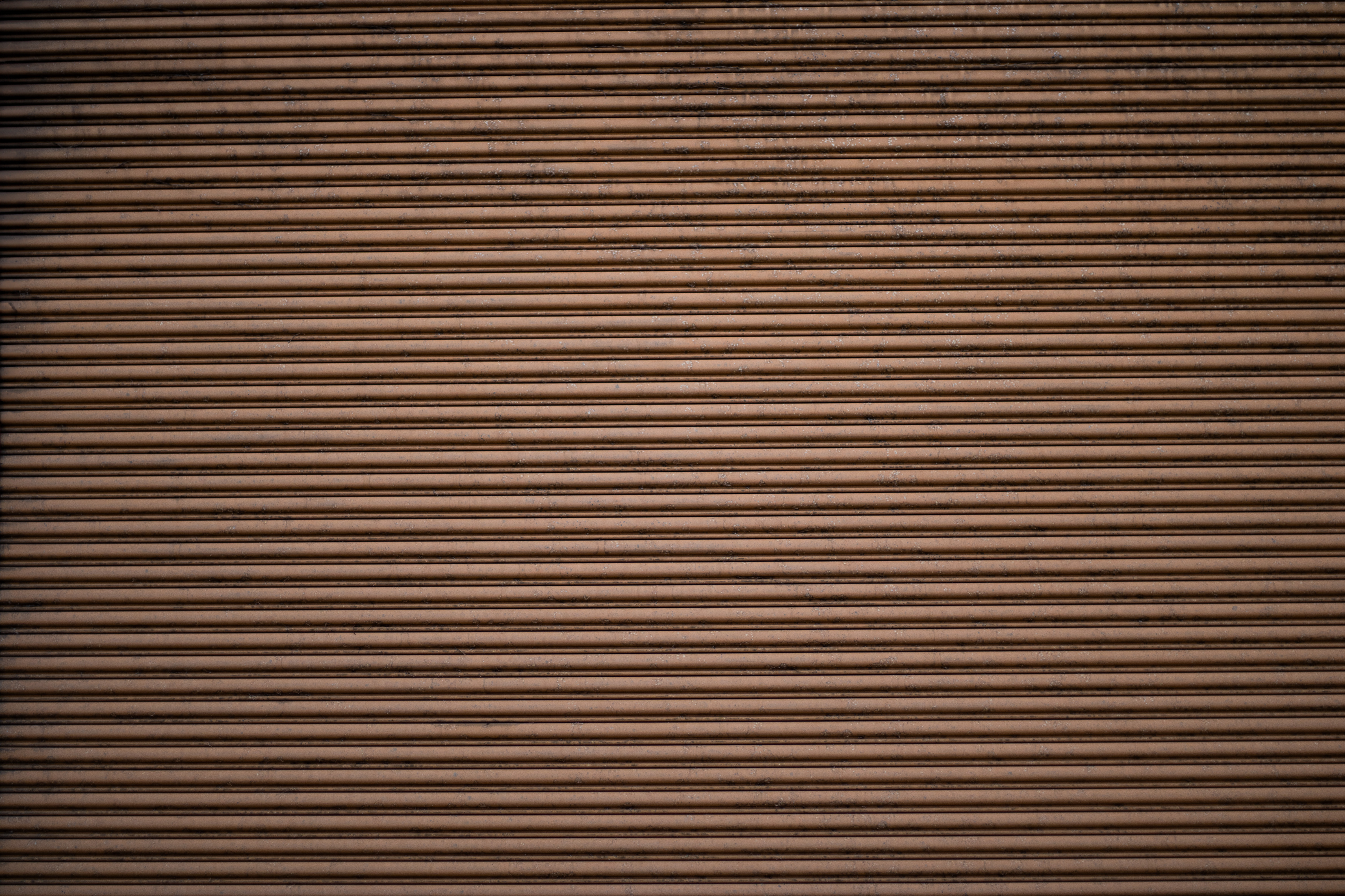
My goal was to bring out this image’s strongest features of shadow, yellow and red tones, and an element of chaos brought by the pipes. I think coming back at a later time of day might enhance the natural lighting of the piece. When I edited the photo, it was often too harsh and sharp. Couldn’t quite get it right how I wanted it to look.

Another favorite. I wonder how it would look printed. This one looks radically different depending on what screen display you are looking at it from. I love the way it looks on my computer, but on my phone it looks a lot weaker.

This photo also works in color, but the color and the black and white versions need to be edited in different ways to work as best as they can. Exaggerating the brilliance, for strong depth in the case of the black and white version, complements the compositional elements of the photo. Examples: the top and bottom of windows, how the light gradient(?) moves up the brick walls, the sharp straight angular and casted building shadows.


This is my favorite from the set. This is not real blood, in reality it is actually a water stain. I edited the photo in Photoshop to include a red stain rather than a water stain, and leveraged the mid-lights and mid-darks to create a spooky and eerie contrast between 5 points, 1) the blaring lightbulb on the right, 2) the natural light creeping down from the stairs, 3) the relativly light shadows cast from the stairs, 4) the harsh, dark dividing line created by the stair itself, and 5) the “blood stain”. Elements like the slight but noticible presence of the floor below create direction and depth. The shadowy glimpse of the upper stairs; and the illuminated metal wire going leftwards, leave the audience curious about the rest of the scene as their eyes always end up glancing back over the bloody red stain dripping from hidden elements above.

Another Andreas Gursky inspired work. This one shows the importance of lighting. If I were to take this again it would be important to bring a tripod, and to shoot with a longer exposure. This photo’s light and darks are crushed too closely to create the necessary effect, to be something greater than a photo of a brick wall.